Portfolio [identity]
LETTERHEAD:
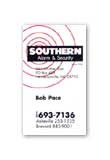
The Client: Southern Alarm and Security
The Challenge: Develop an updated identity for well established security company that had been using the same logo for the last 30 years.
The Solution: Using a clean sans serif typeface, the new logo projected a more high-tech company - which it is. The concentric circles added a dynamic element to the stationery and fleet graphics. When used elsewhere the circles were confined to the borders of the logo.
My Role: Concept, logo design and execution
